A Logo Rooted in Three Forks History
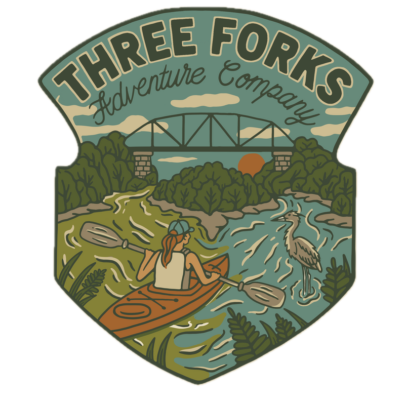
The Three Forks Adventure Company logo is more than a business design. It tells the story of the place that inspired the company.
Created and illustrated by Aubrey Fingerson of Restoration Acres, the logo draws from the landscape surrounding Beattyville and the birthplace of the Kentucky River. Every part of the design reflects something meaningful about our waterways, history, and outdoor experiences.
The biggest inspiration came from an aerial photograph showing the North Fork and South Fork of the Kentucky River meeting in Beattyville. In the photograph, the two rivers are noticeably different colors as they flow toward one another. I wanted that natural contrast preserved in the logo, so Aubrey illustrated each fork in a different shade before showing them joining together. It is a detail that makes the artwork unique to this exact location.
The historic Maloney Railroad Bridge was another important source of inspiration. Its metal framework and the limestone bridge piers from the history L&N Railroad line are familiar landmarks along the river and reminders of the railroad history that helped shape our community. Aubrey incorporated both the bridge and the stone piers into the design, connecting today’s river adventures with the history that still stands along the water.
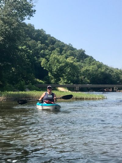
The paddler represents the heart of Three Forks Adventure Company—helping people get outside, explore our rivers, and experience Eastern Kentucky from the seat of a kayak. The great blue heron reflects one of the river’s most recognizable residents and the wildlife paddlers may encounter along the way. The surrounding hills, trees, and flowing water bring the entire scene together.
The colors also reflect the natural character of our region: forest greens, earthy browns, limestone tones, river blue, and the warm orange of the kayak and setting sun. Together, they give the logo the look of a vintage outdoor adventure patch while remaining unmistakably connected to Beattyville and the Kentucky River.
Aubrey took the ideas, photographs, and landmarks that mattered most to me and turned them into an illustration that tells our story at a glance. The result is a logo that feels adventurous, historic, local, and authentic.
Three Forks Adventure Company was created to help more people discover the rivers of Eastern Kentucky through equipment rentals, guided paddles, special events, and memorable outdoor experiences. This logo represents where those adventures begin—at the meeting of the North and South Forks, the birthplace of the Kentucky River.